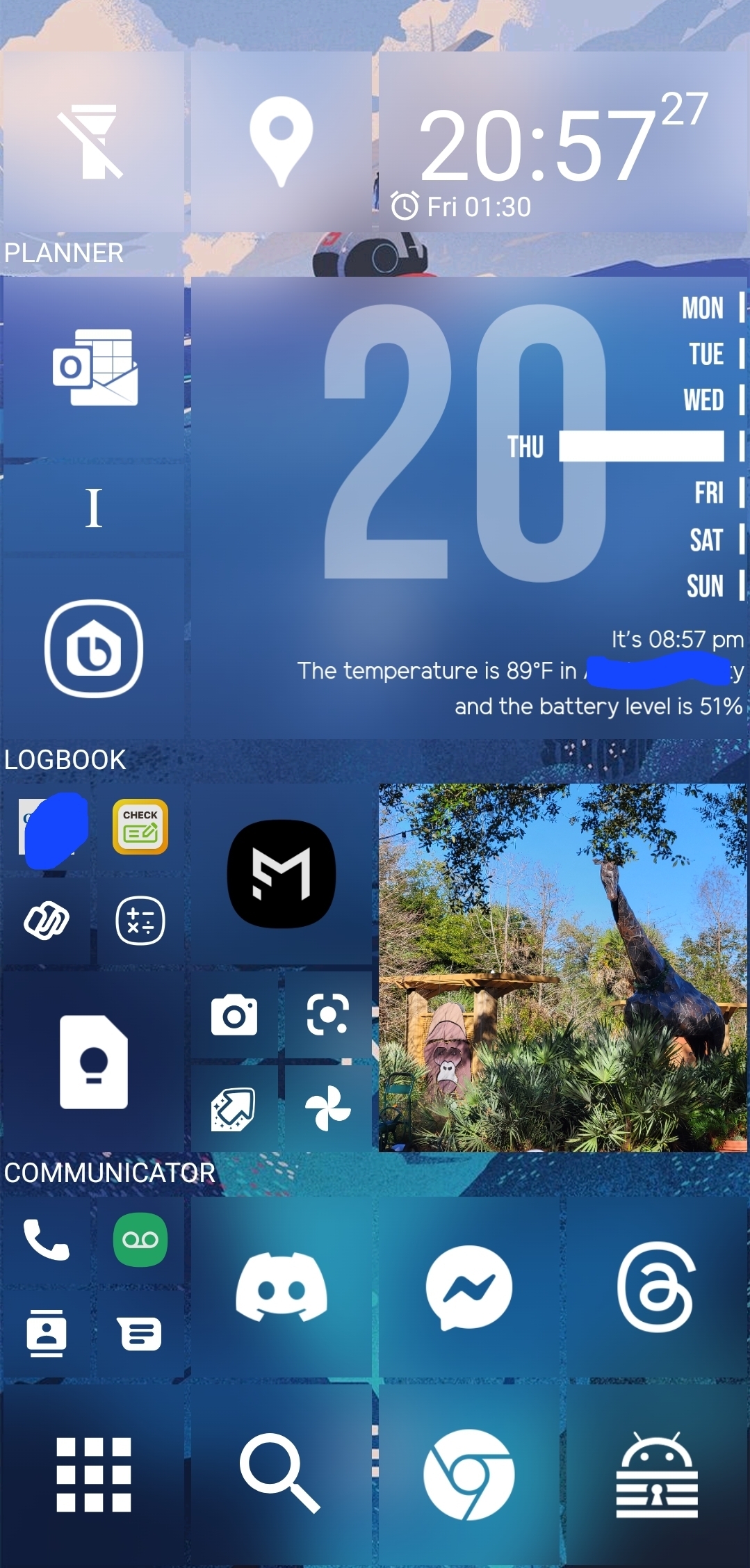
Despite its failure to capture a significant market share, I really enjoyed the metro UI on windows phone and tablet. One UI on my Samsung was getting stale and has a nearly unusable apps drawer, and standard Android notifications are nagging and ungainly.
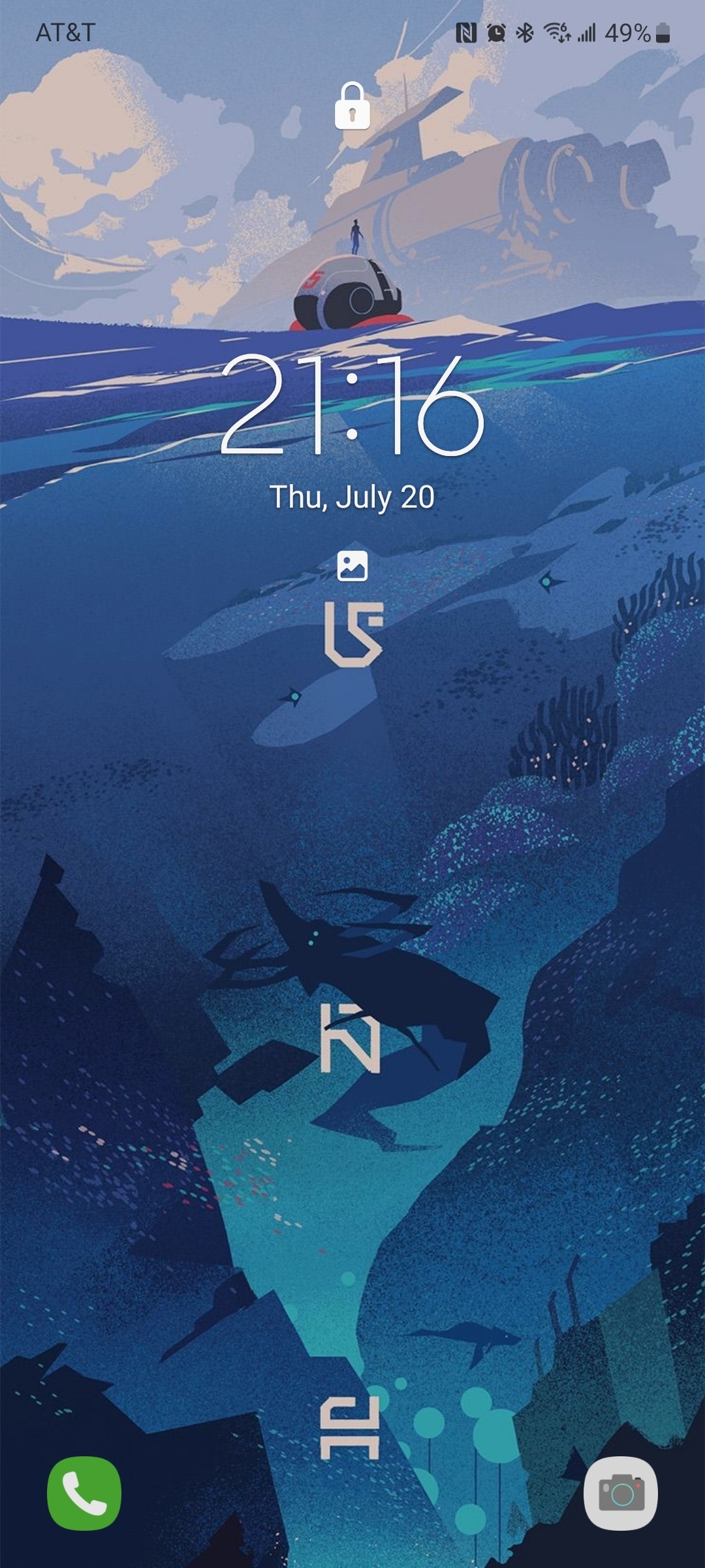
So I went looking for launchers and icons to get my live tiles back, and what do you know, these are available and they rule. Sharing here so others can try, plus a killer home screen background for good measure.
Apps: SquareHome and WHicons
Squarehome is surprisingly thorough in replicating live tile functions - all apps which are capable of image notifications will display on the home screen with a pic and summary/text right on the icon. You can dismiss with a long press, and exclude any apps from notifications that you prefer.
The consequence of this is that you don’t need to use the android notification list at all if you don’t want, and by getting selective you can avoid the bombarding nature of android style alerts. I actually find myself checking the apps LESS, and I consider it a good thing.
The launcher also gives you some interesting options for hiding the ever-present android interface: you can hide the top bar while on the home screen(s), as well as the nav buttons. You can enable scrolling instead of paging for your home. There are built-in shortcuts to storage, settings pages and configurables (silent mode, wifi etc).
Tile sizes are fully customizable. Included widgets are compatible with the major productivity suites. (Switched to outlook as you might imagine). Most users suggest using WHicons for the right look, which has a few thousand icons that automatically apply to the appropriate app.
App drawer has a list function if you hate the Samsung UI app moshpit. And I do. It also has a full suite of software and hardware shortcuts for things like ‘activate flashlight’ or ‘load a file using this application’.
Spent a few days fiddling, but I couldn’t be happier with it now.
The background is by u/jmlan


Wanted to clarify that, while colors and spacing are customizable, I didn’t create or extensively modify the launcher apps, only the layout. It’s not rainmeter levels of remixing or anything. In particular, I don’t have as much control of the widgets as I’d like, and would probably tone down the calendar or picture gallery if I could.
Though its not to diminish your read of it, I’m happy to explain my particular choices! You’re right that this layout is not visitor-friendly, but like you said, it’s a phone. Not really for sharing. That said, there IS a hierarchy of sorts, just not an obvious one - I’m left-handed, so anything I use with quick, one-handed input is in an arc from the bottom left (calculator, macronutrient tracker, checkbook). From there, apps in frequent or varied use, or with inline notifications, are larger. This way I can read a summary of a message or alert without opening the app or Notification Shade. From there, web browsing and social media is at the bottom for lots of thumb typing, while the morning routine (news, weather, traffic) is at the top for use on a desk.
With a UI for general use, having to explain in such detail would be a sign of failure - I would indeed settle on a simpler rubric if it was a company tablet. But I love the little eccentric choices I can make with this launcher to make it just for me. Hope that proves interesting!